Crafting Compelling Calls to Action: Design Tips for Higher Conversion
Introduction
In the digital marketing landscape, Calls to Action (CTAs) are the pivotal moments that dictate whether a user will convert or bounce. A well-designed CTA can significantly increase your conversion rates, making it essential to apply strategic design principles. This article provides actionable tips for designing CTAs that effectively guide users to take the desired action.
Use Action-Oriented Language
Your CTA should clearly state what action you want the user to take. Use verbs that inspire action, such as "Download," "Subscribe," "Join," or "Get Started." This direct approach removes ambiguity and tells users exactly what to expect when they click.
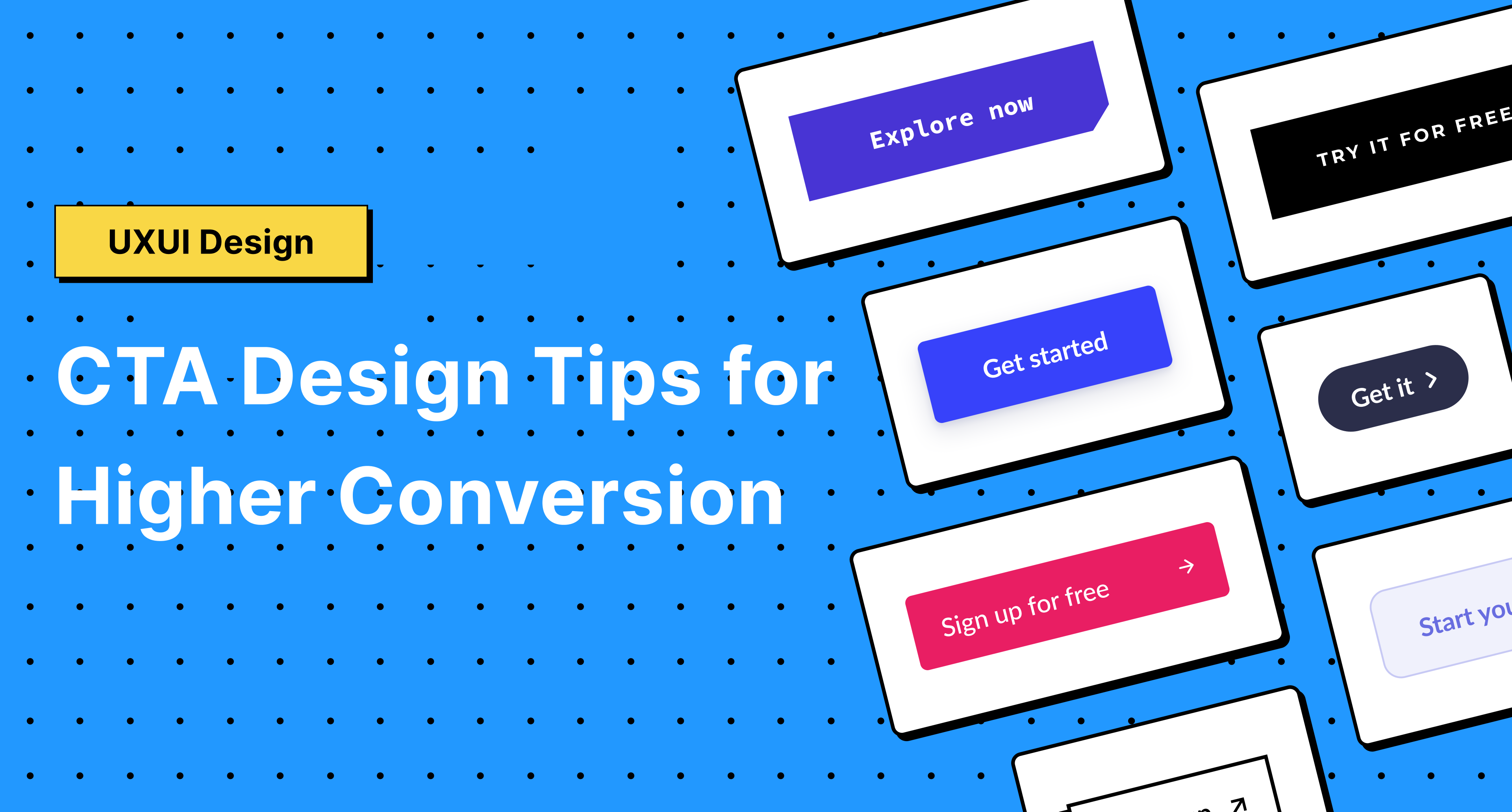
Make It Visually Striking
The design of your CTA button should make it stand out from the rest of the page. Use contrasting colors to draw attention but ensure they complement your overall design scheme. The button itself should be large enough to be noticed but not so large that it overwhelms the page.
Consider Button Shape and Size
The shape and size of your CTA button can influence user interaction. Rounded corners are generally more appealing and can increase click-through rates. The size should be balanced; too large may appear aggressive, while too small could be overlooked.
Leverage White Space
Don’t underestimate the power of white space around your CTA. It can help to make the button stand out and draw the user's eye directly to it. Adequate white space creates a visual breathing room that emphasizes the importance of the CTA.
Create a Sense of Urgency
Incorporating a sense of urgency or scarcity (e.g., "Limited Offer," "Only a Few Left," "Sale Ends Tonight") can encourage users to act immediately. However, use these tactics sparingly and honestly to maintain trust with your audience.
Optimize for Usability
Your CTA should be easily clickable across all devices. This means optimizing for both desktop and mobile users. On mobile devices, the CTA should be easily tappable with a finger, so consider the button’s placement and size on smaller screens.
Test and Optimize
A/B testing is invaluable in CTA design. Experiment with different texts, colors, and placements to see what works best for your audience. Analyze the data to make informed decisions about which CTA elements are most effective in driving conversions.
Use First-Person Language
Changing the language to the first person can make the CTA more personal and relatable. For instance, "Start My Free Trial" often performs better than "Start Your Free Trial." It creates a sense of ownership and immediacy that can be very persuasive.
Align CTA with User Intent
The CTA should align with what the user is expecting to find or achieve on your page. If your content promises to solve a problem, the CTA should offer the solution. Misalignment between user intent and CTA can lead to higher bounce rates.
Conclusion
Designing an effective CTA goes beyond aesthetics; it requires a deep understanding of psychology, user behavior, and strategic design principles. By implementing these tips, you can create CTAs that not only stand out visually but also resonate with users, compelling them to take action. Remember, the goal is to guide users towards a decision seamlessly, making the process as intuitive and enticing as possible. As with all aspects of design and marketing, continuous testing and optimization are key to finding what works best for your audience and achieving higher conversion rates.